

CI
Introducing the NDIT Corporate Identity
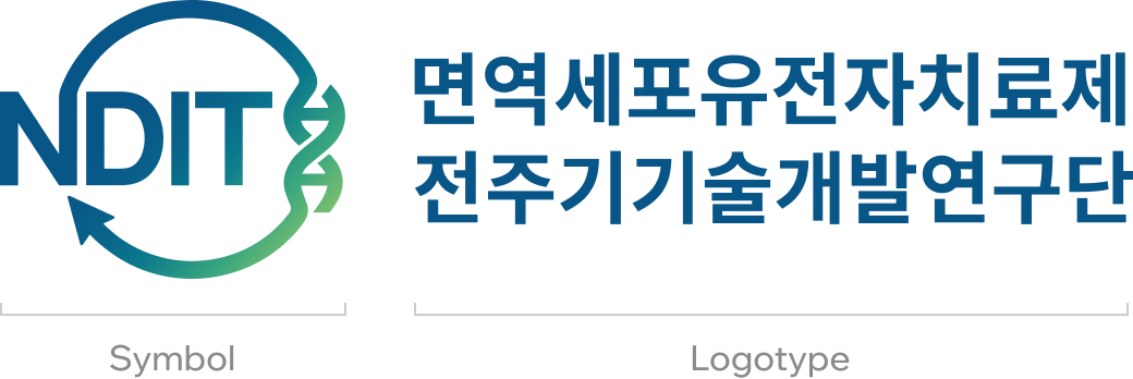
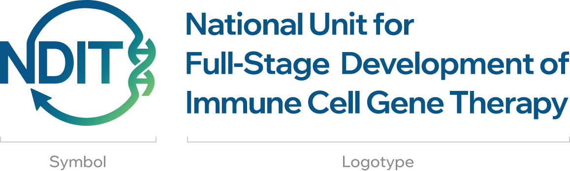
The corporate identity of the National Unit for Full-Stage Development of Immune Cell Gene Therapy (NDIT) combines a distinctive symbol and logotype that reflect NDIT's mission as a full-stage research and development platform for immune cell gene therapies.
The circular arrow surrounding the NDIT symbol represents the continuous journey of innovation, spanning basic research, clinical development, and commercialization.
The DNA motif integrated into the arrow signifies advanced immune cell gene therapy technologies driven by precision genetic engineering.
.jpg)
Signature
Korean type


English type

Mixed type

Color system
- Pantone
- 132C6F
- CMYK
- 94,37,0,47
- RGB
- 8,85,135
- HEX
- #085587
- Pantone
- 2401 C
- CMYK
- 66,0,23,35
- RGB
- 57,166,127
- HEX
- #39A67F
- Pantone
- 2210 C
- CMYK
- 16,0,54,16
- RGB
- 180,214,98
- HEX
- #B4D662
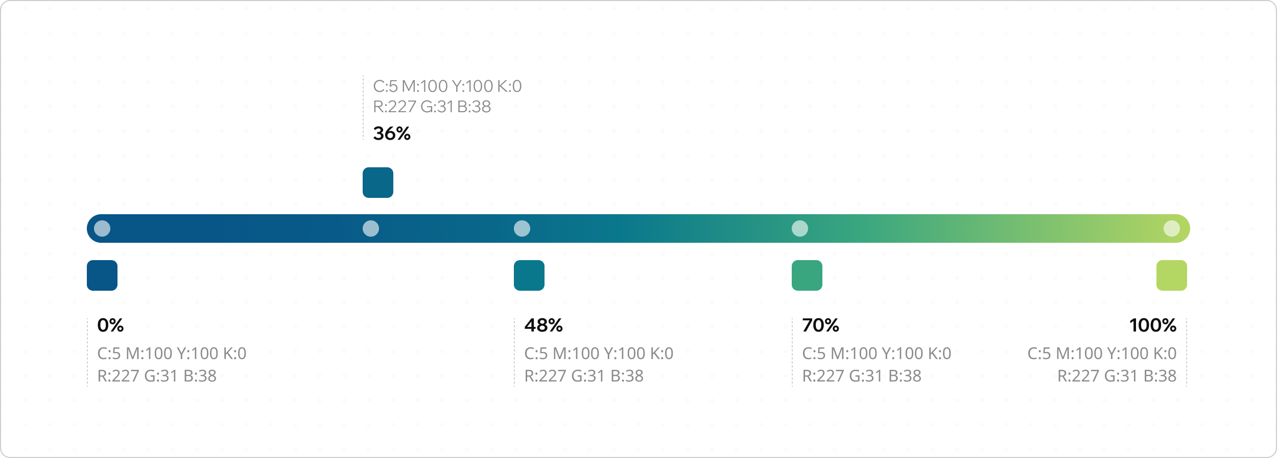
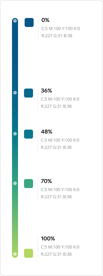
Gradation
The gradient from blue to green embodies NDIT’s vision—transitioning from trust and professionalism (Blue) to life, recovery, and the future (Green). It represents NDIT’s commitment to unlocking new possibilities for human health through science and technology.